Greetings all –
For Blog Report #7, you are already being asked to create a media-based artifact from your research on your information community’s use of emerging technologies. Your artifact might take the form of an infographic, video, slideshow, audio presentation, or another creative format that helps communicate what you have learned. This assignment invites you to think visually, rhetorically, and creatively about your community and the technologies that shape its information practices.
This term, I want to offer an optional variation for students who would like to experiment with the new Images feature in our SJSU GPT. I am doing this because when I watched an introductory video on the new images upgrade to Chat GPT it blew my mind at how fast it can create an infographic. The 200 instructors and I are discussing making this an option formally next fall.
Optional version of Blog Report #7
Instead of creating your artifact entirely in a separate design tool, you may choose to use the Images feature in SJSU GPT to generate an infographic related to your research.
Your infographic may focus on:
- your information community as a whole
- your community’s use of emerging technology
- one of your earlier blog reports
- a major course assignment
- your literature review notes or try uploading your LRM as a PDF!
- an outline of your research paper
- another aspect of your research that helps explain your community
In other words, this does not have to be limited to one narrow topic. The infographic should still connect clearly to your INFO 200 research and to your chosen information community.
Why try this?
This option gives you a chance to experiment with AI as a tool for synthesis, design, and communication. In INFO 200, we have been thinking all semester about information creation, exchange, access, and emerging technologies. This option lets you explore those ideas in practice by using a new tool to transform your research into a visual artifact.
The goal is not to let AI “do the assignment for you.” The goal is to see what happens when you use AI thoughtfully, critically, and reflectively as part of your own research and writing process.
An example from my own experiment
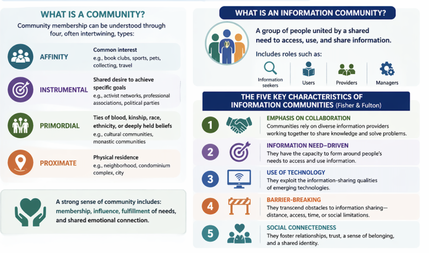
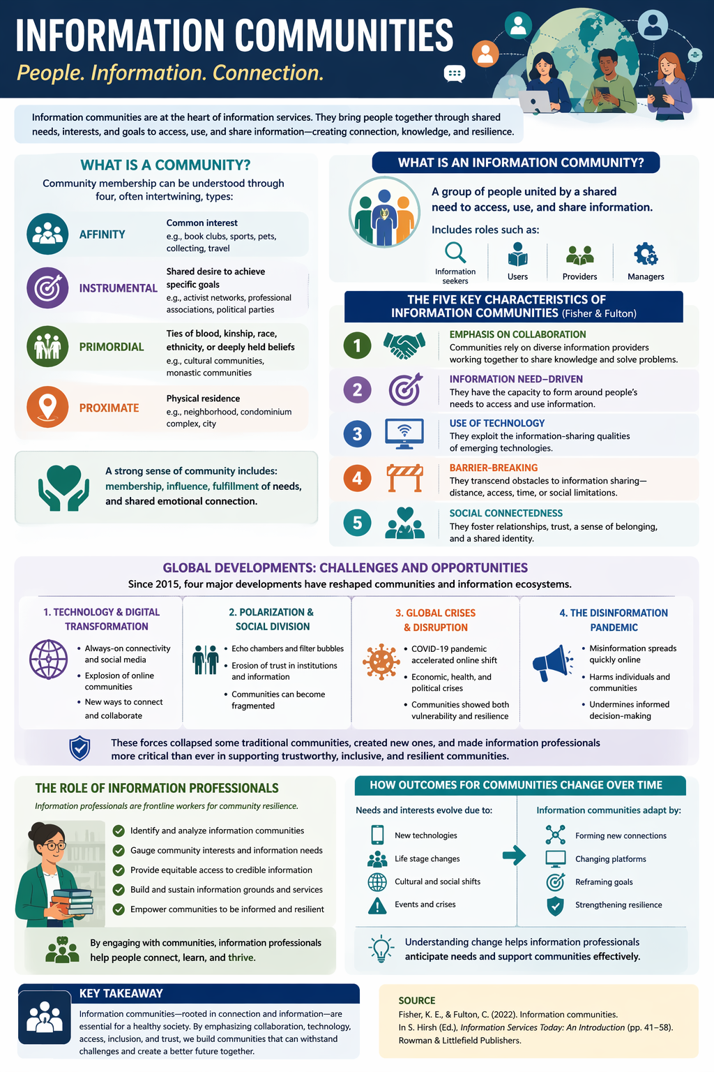
I tried this myself by asking the Images tool to create an infographic based on the Fisher and Fulton chapter on information communities.
My first prompt was:
Create an infographic from this chapter by Fisher and Fulton for INFO 200 Information Communities.
I uploaded the full chapter PDF and let the tool generate a visual summary.
The result was pretty good, but it left out something essential for our class: the five characteristics of information communities. Since those are so important in INFO 200, I revised my prompt and asked it to try again.
My follow-up prompt was:
Please remake the infographic and include the five characteristics because they are very important to our class.
That revision improved the result. This is a good reminder that prompting is part of the learning process. You may need to revise, clarify, and try again in order to get a result that better reflects the concepts and priorities of the course. Here it is:
How to try this option
If you want to experiment with this optional version of Blog Report #7, here is one way to proceed:
Step 1: Choose material from your own work
Select something from your course research that would work well as the basis for an infographic. This could be:
- notes you have taken on your community
- an outline for your research paper
- one of your previous blog reports
- a section of your literature review matrix
- a course reading that helps frame your topic
- a draft explanation of your community’s information behaviors, needs, services, or technologies
Step 2: Decide what you want the infographic to emphasize
Think about the message you want the visual to communicate. For example:
- key themes in your research
- major findings about your community
- how the community uses emerging technology
- connections between your research and course concepts
- a comparison, process, timeline, or framework
Step 3: Open the Images feature in SJSU GPT
Use the Images feature and ask it to create an infographic based on the materials you provide.
A simple starting prompt might be:
Create an infographic for INFO 200 based on the following notes about my information community.
Or:
Create an infographic based on this blog report about my information community and its use of emerging technologies.
Or even:
Create an infographic from this chapter by Fisher and Fulton for INFO 200 Information Communities.
Step 4: Revise the prompt if needed
Do not assume the first version will be complete or accurate enough.
Look carefully at the output and ask yourself:
- What is missing?
- What needs to be more specific?
- What course concept needs to be included?
- Is the visual emphasizing the right ideas?
- Is anything oversimplified?
Then revise the prompt.
For example:
Please remake the infographic and include the five characteristics of information communities because they are central to INFO 200.
You might also ask it to:
- include specific terminology from course readings
- emphasize your chosen community
- use a more academic or professional tone
- simplify the layout
- reorganize the information into sections
- include labels, headings, or a process flow
Step 5: Evaluate the final result critically
Your job is not just to generate an image. Your job is to evaluate whether the infographic actually represents your research well.
Think about accuracy, emphasis, clarity, and connection to INFO 200 concepts.
What to submit
If you choose this optional version, post both of the following to your blog:
1. Your infographic
Embed or upload the infographic to your WordPress blog.
2. A brief memorandum
Along with the infographic, include a short memo that explains your decision-making process.
Your memo should address the following:
- what you chose to highlight from your research and why
- how your choices connect to course concepts or frameworks
- what you left out and how you made those decisions
- the prompt you used to generate the infographic
- any revisions you made to the output
- a short reflection on the experience of using AI for this kind of synthesis
A few suggestions for success
- Start with material you already understand well.
- Be specific in your prompt.
- Expect to revise at least once.
- Check the output against your notes and course readings.
- Make sure the final artifact reflects your thinking and priorities.
- Use the memo to show your synthesis, reflection, and critical judgment.
Keep in mind
This option is entirely optional. If you would rather create your Blog Report #7 artifact using another tool or format, that is still absolutely welcome.
But if you are curious about AI image generation and want to explore it as part of your research process, this could be a useful and creative way to experiment.
I am sharing my own example because I found the process genuinely interesting: the first version was promising but incomplete, and revising the prompt made the result much stronger. That kind of iteration is part of the point.
I look forward to seeing what you create.
Please comment below with any questions or thoughts you have about this or if there’s anything I can clarify.
Total transparency: I asked the GPT to draft this post for me and dictated a giant story about how I made the graphic above.