

Hello all,
I am collaborating with Professor Sue Alman and two of our students on an independent study to develop infographics for various courses in the MLIS program. We have created a draft of the revised version of the Infographic 200.
To gather feedback from our students, we have shared the draft with you. Please take the time to review the layout and content of the infographic and provide your thoughts below. Your insights will be invaluable in refining the design and ensuring its effectiveness.
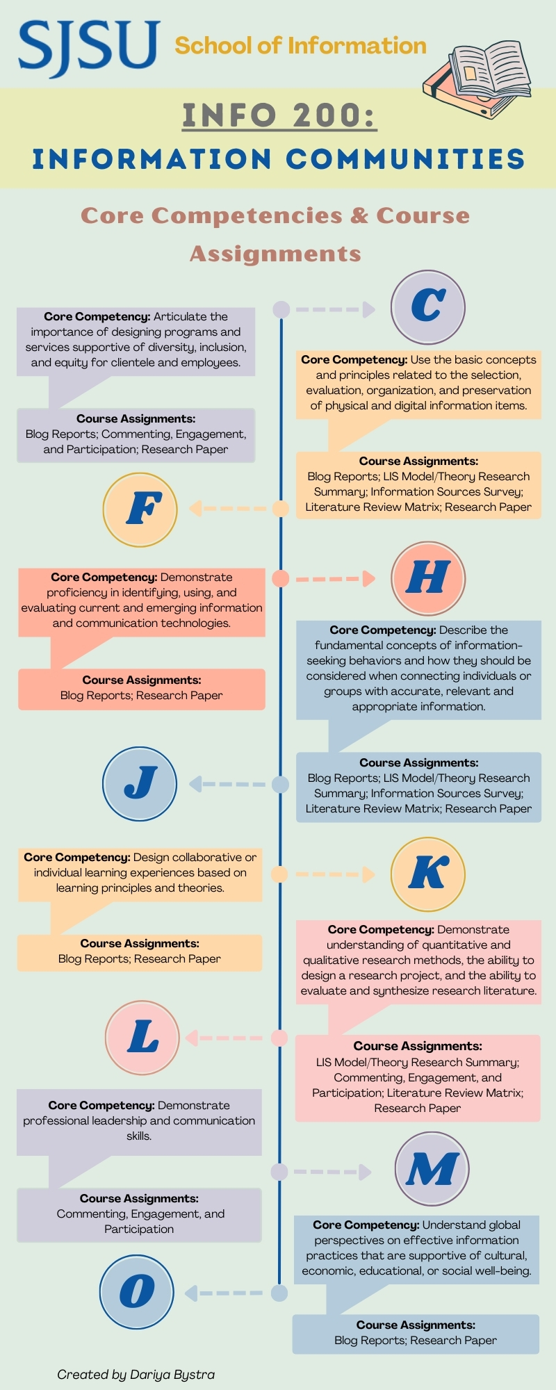


@Michael What an awesome infographic! I just completed a core competencies assignment for INFO 203. This would’ve been really useful (I used the original one you shared earlier in class). I would like to suggest that the arrows get flipped so that they go from Core Competency Letter to the explanation and assignments for a better flow.
This is so helpful, thank you to your team for working on this! From an accessibility standpoint, I agree with @omarmolejo03‘s suggestion to keep the letters and corresponding competency/assignment descriptions on the same side and in a logical reading order. This will also reduce the need to rely on color to link the relevant bits of information together, since some folks perceive color differently.
I’m not sure what file type/format this infographic will be, but I suggest making sure there is “true text” by adding optical character recognition or alternative text, if you have not done so already.
Since this infographic uses pastels, I also suggest testing the colors of the text and background using the WebAIM contrast checker: https://webaim.org/resources/contrastchecker/
I agree with the comments that have already been submitted here. The zig-zag organization of the infographic threw me off guard. From a design standpoint, the vertical “timeline” style view doesn’t serve much purpose since the competencies are not completed alphabetically. The line also doesn’t serve any purpose in logical progression since the competency descriptions and the corresponding letters flip to either side with each competency.
The muted colors are a nice concept, but since the contrast is low, it gives a bit of a weak impression. The color combinations (especially the yellows and goldenrod/mustardy yellows used on the circles of the “K” and “F”) are a bit painful to look at in combination as well, at least to my eyes.
I appreciate the effort put into making a graphic. I struggle to understand walls of text or Excel-style charts, so I’m very much looking forward to seeing how this project turns out!
In addition to the items already mentioned (although to drill again, the colour contrasts fail WCAG AA accessibility):
English is RTL, not LTR; the first heading (C) definitely should not be on the right. The large character draws the gaze, but then you must look *against* the direction of the arrow to read the corresponding text. The arrows and letters are at the top, middle, and bottom aligned with the corresponding text boxes, but the difference carries no meaning.
Bah, English is NOT RTL :p
Everyone – Thank you for the feedback!